(Client)
Meridian Bridge
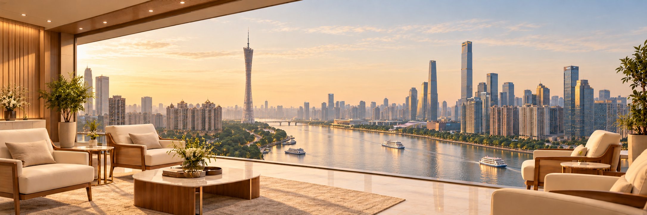
Case study
2026 (live)
 MeridianBRIDGE
(01)
Meridian Bridge is a Canadian-led concierge for health screening in China.
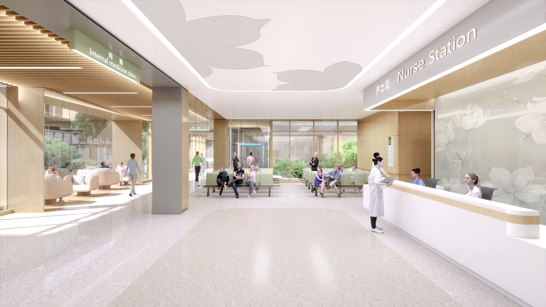
Meridian Bridge books health screenings and scans at government-certified hospitals in Guangdong, China. Canadians can wait 30 weeks for an MRI; Meridian Bridge can book the same scan the same day.
(02)
The ask.
Make going abroad for a health check feel safe, calm, and premium.
It needed to earn trust from people making a big health decision far from home.
Earned
trust
Quiet
premium
East
meets west
Peace
of mind
Visuals that tie in the cultural depth of health, and its seriousness.
Positioned as boutique hospitality, not a cold clinic.
A global journey to clear health answers.
Calm, attentive care in every touchpoint.
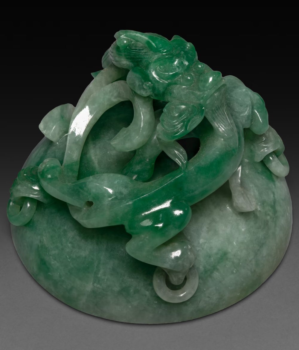
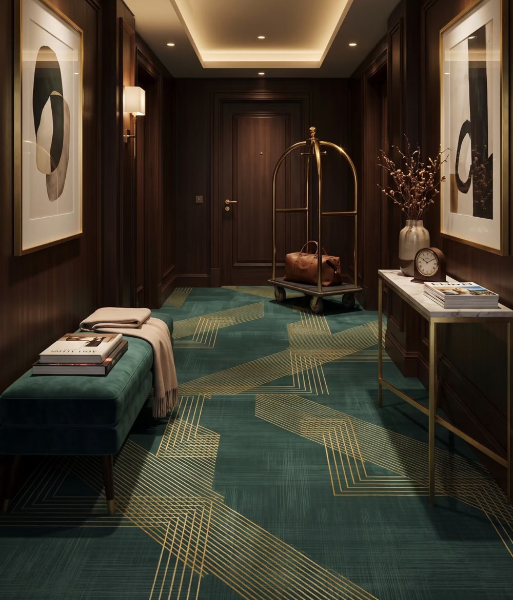

Jade#2B5C3F
Evergreen#14312B
Brass#D49C57
Warm stone#CBC0AE
Doesn't change with the seasons. For a health decision, that steadiness reads as trustworthy, not trendy.
In Chinese culture jade signifies health, protection and value that's earned rather than flashy.
The premium accent: warm rather than shiny, quality without tipping into gold luxury.
A soft, earthy neutral for backgrounds and supporting elements.
Ink #26231B · primary text, a warm near-blackIvory #DBD9CF · main background, calm, never clinical
 MeridianBRIDGEMeridianBRIDGE
1 soft crossing
between 2 places.
The soft curve of the bridge crossing mimics the curvature of the globe, a quiet signal of an international journey. It reads as a smooth, premium experience rather than something corporate or institutional.
(Primary typeface)
Aa
EB Garamond
ABCDEFGHIJKLMNOPQRSTUVWXYZ
abcdefghijklmnopqrstuvwxyz 0123456789
Classic, scholarly and soft in rhythm. Set for headlines and editorial accents; more traditional and wise than modern serifs, which suits the older audience Meridian Bridge serves.
(Secondary typeface)
Aa
Source Sans Pro
ABCDEFGHIJKLMNOPQRSTUVWXYZ
abcdefghijklmnopqrstuvwxyz 0123456789
Clean, approachable and neutral. Body copy and practical information, echoing the modern, well-run hospitals clients will visit.

Capturing the essence of China.
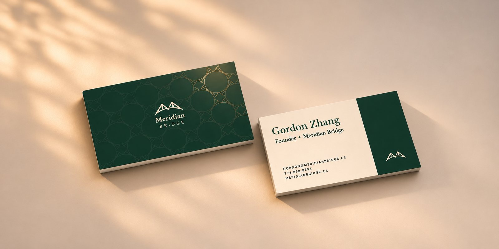
Made by rotating a simplified bridge mark, echoing traditional Chinese lattice. Used very subtly as a backdrop or footer band.
From first scroll
to booking.
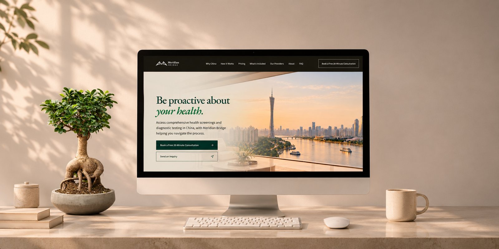
The site turns the brand into a decision tool. It opens on "Be proactive about your health", then puts wait times and costs side by side for the visitor's country, and answers the "is this legit?" questions in order.
visit the live site +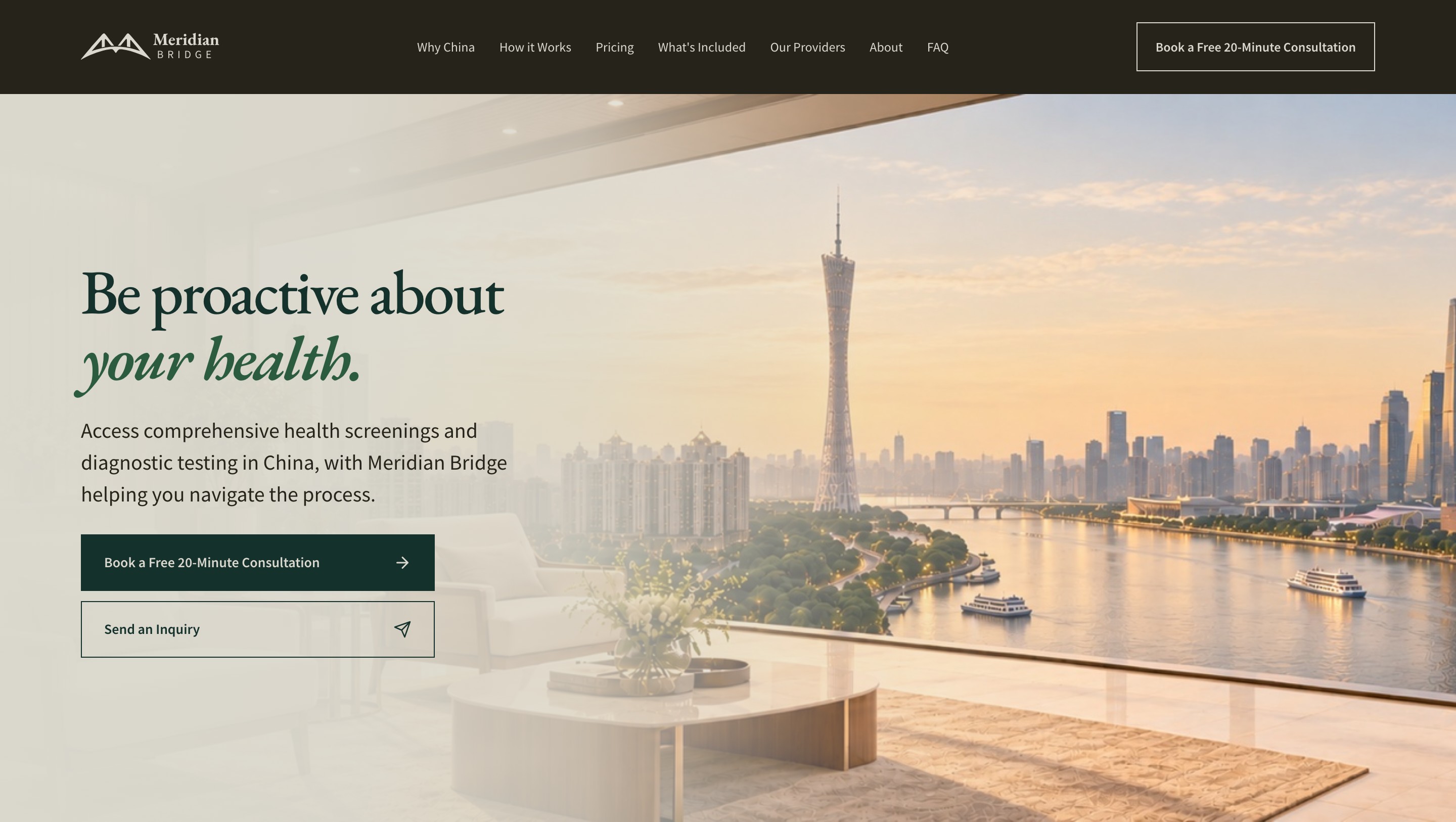
(02)
The ask.
Make going abroad for a health check feel safe, calm, and premium.
It needed to earn trust from people making a big health decision far from home.
Next Project.
alfa tea