(Client)
Alfa Tea Concept
(01)
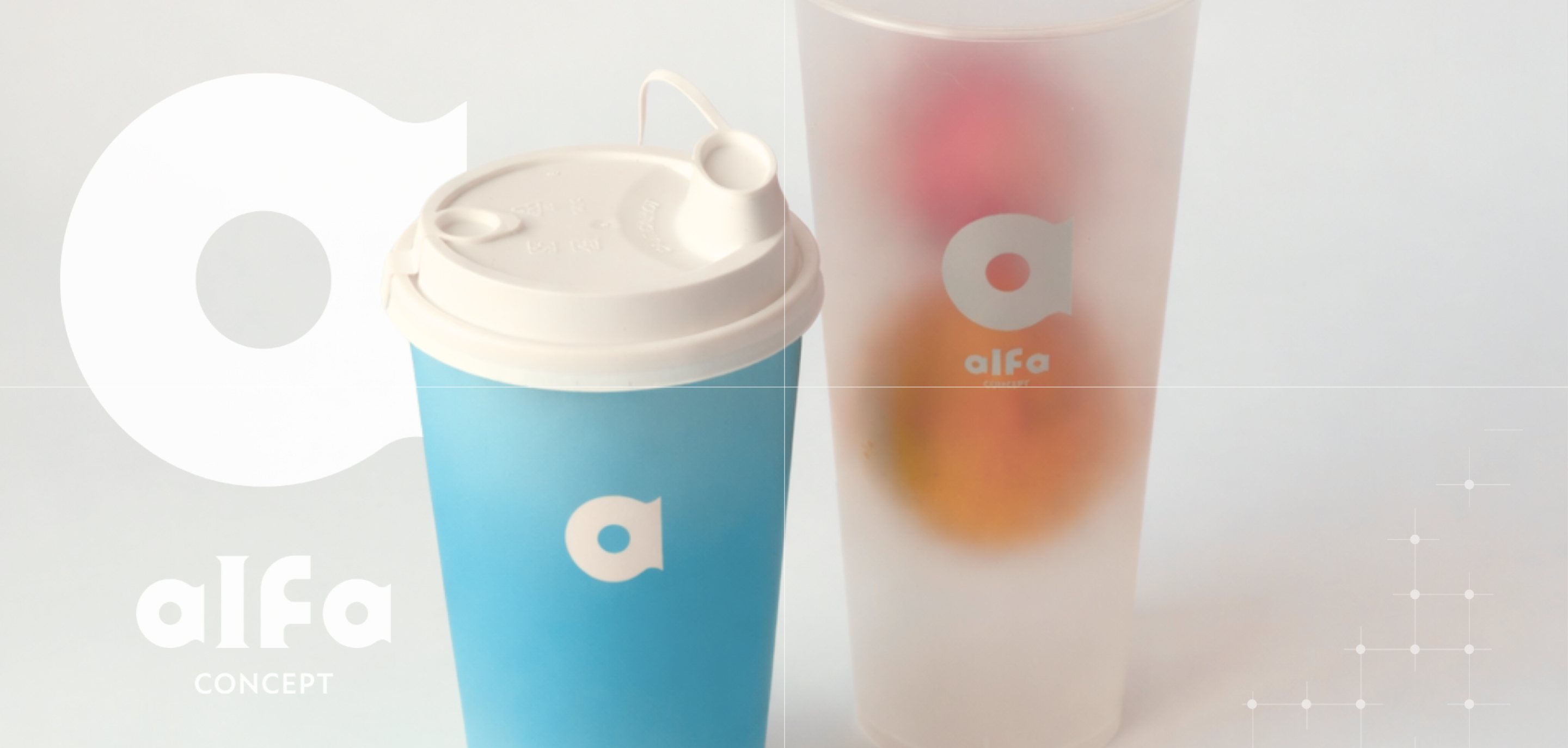
Alfa is a fresh-fruit and tea drink shop, with a brand as light and simple as its drinks, from the cup to the storefront.
Entering a crowded bubble-tea market, Alfa had to win attention on the street and in delivery-app grids.
(02)
The ask.
Stand out among busy, colourful tea shops, on the street and in delivery apps.
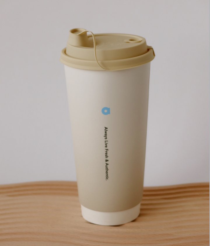
A brand that feels fresh, friendly and easy to trust, letting the real fruit and tea be the hero. The name became the promise: always fresh & authentic.
Fresh
Simple
Light
Authentic
Every cup made fresh to order.
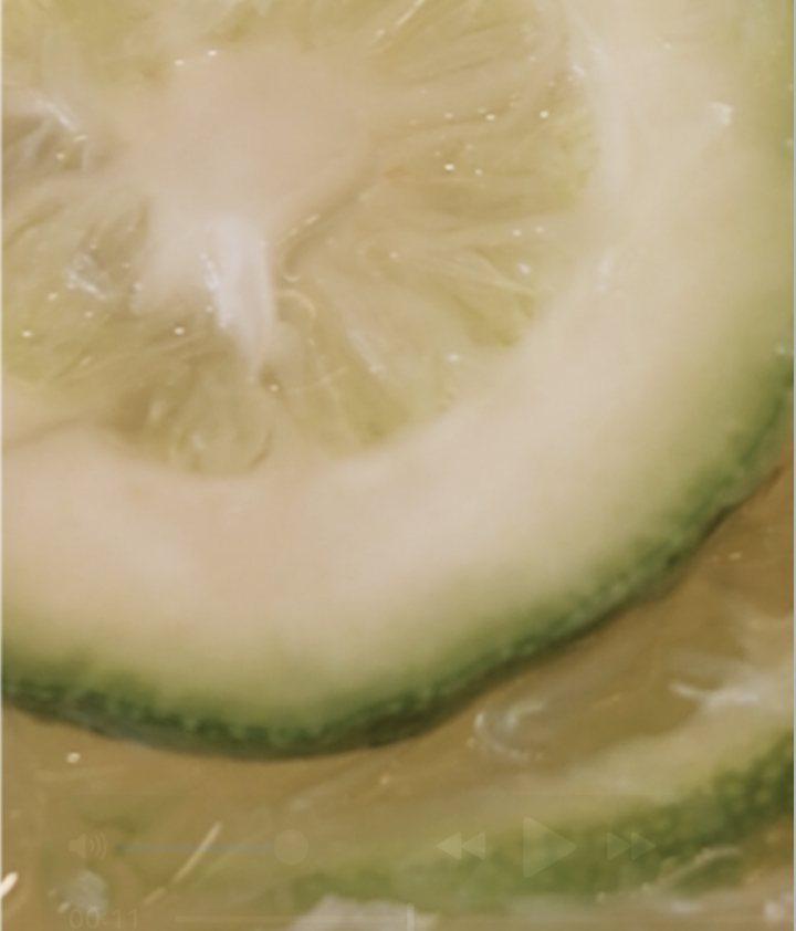
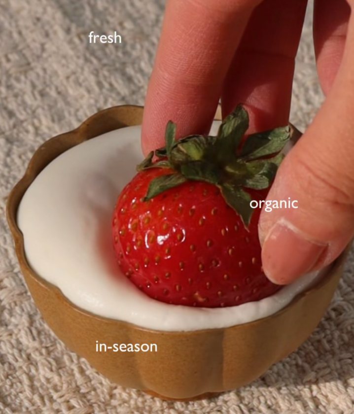
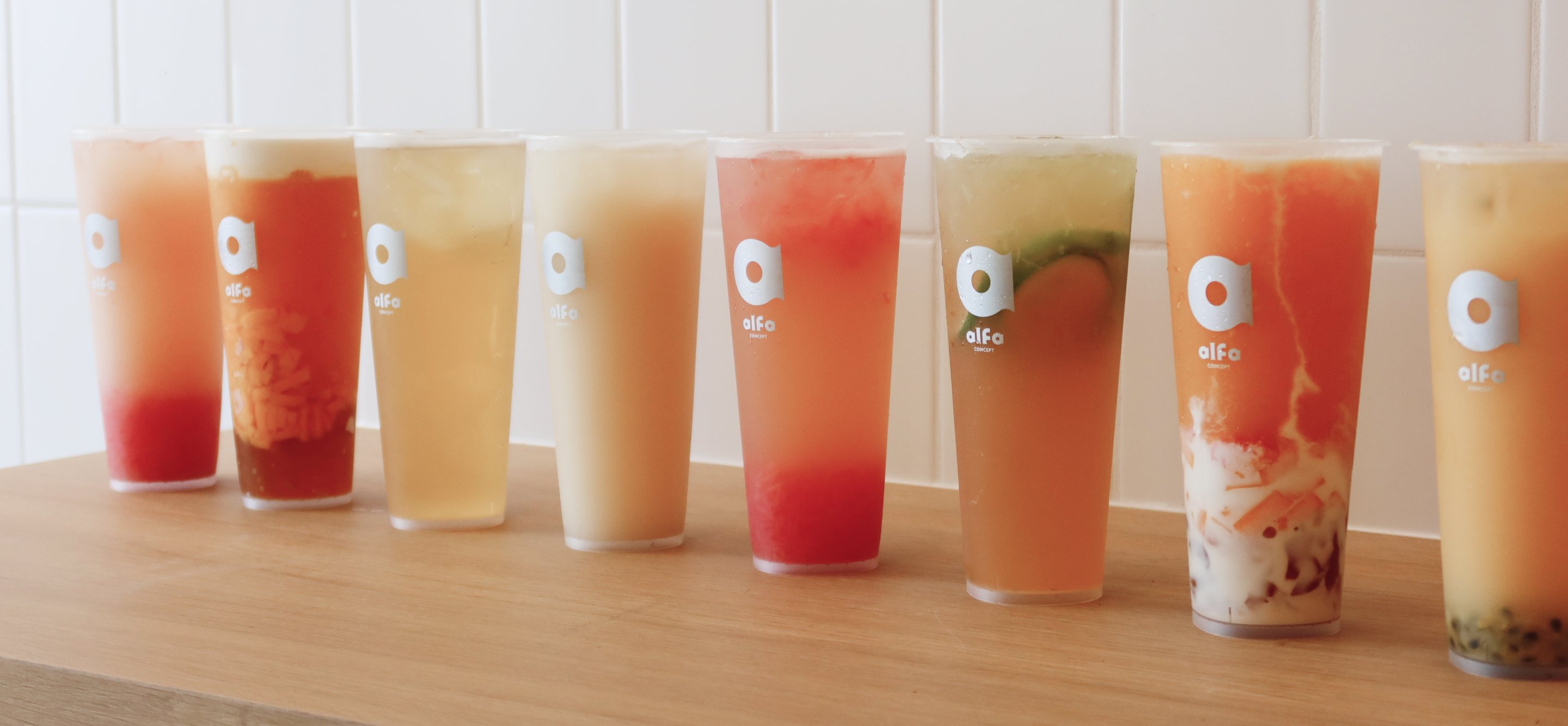
Real fruit, real tea, with pulp you can see through a clear cup.
Drinks that feels light and just right, rather than heavy or dense.
In season ingredients, with origins you can trace back.
Azure#25A5DE
Blue#64C5EC
Latte#E6DCCE
Cream#EAE7E3
The deepest blue: the tagline gradient and the moments that need to pop.
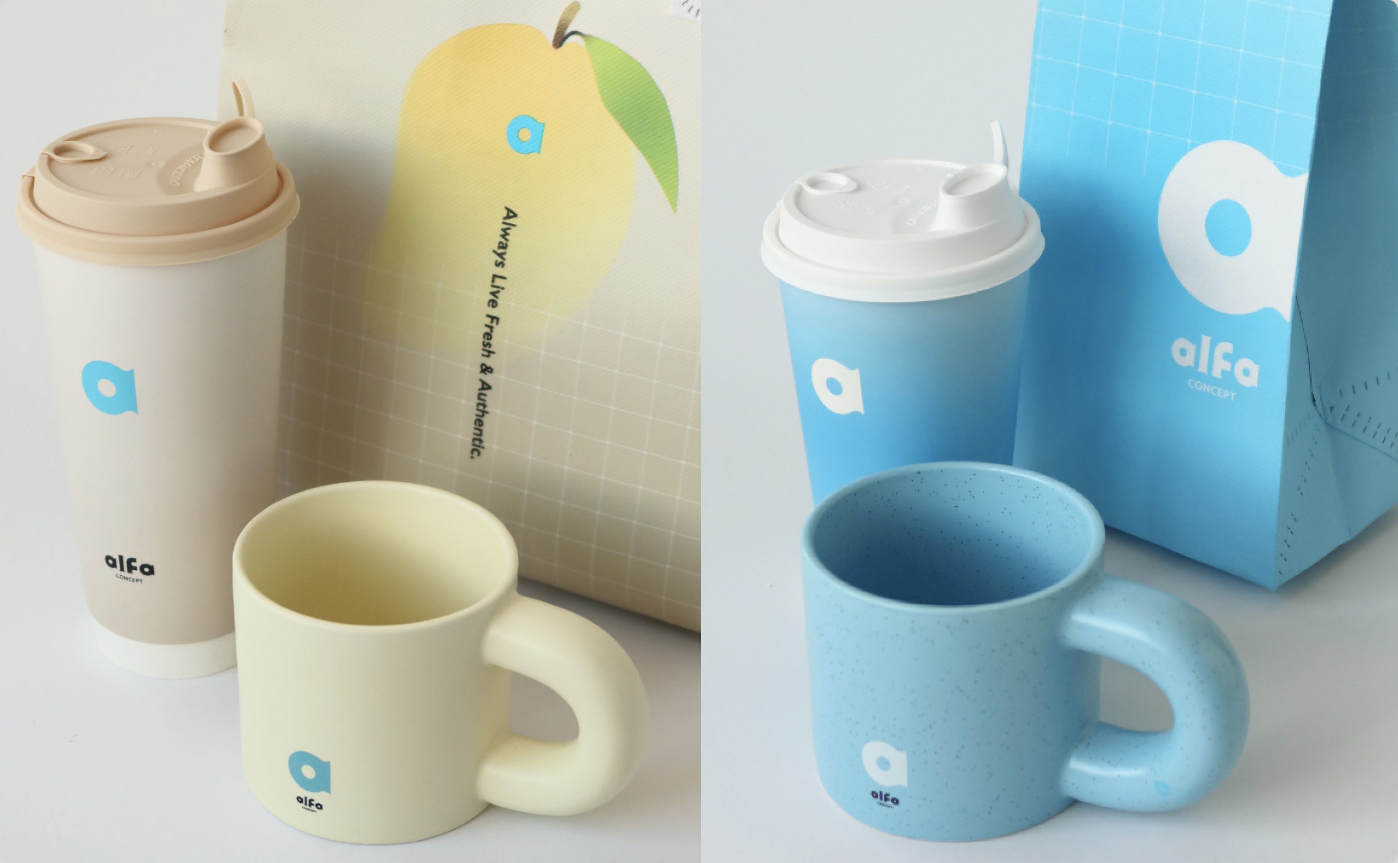
The signature cup and logo blue. It carries the brand everywhere.
A light, icy accent for gradients, highlights and soft backgrounds.
A warm neutral, like a paper cup or a clean counter, so the fruit stands out.
Ivory #F7F5EF · main background, a clean counter
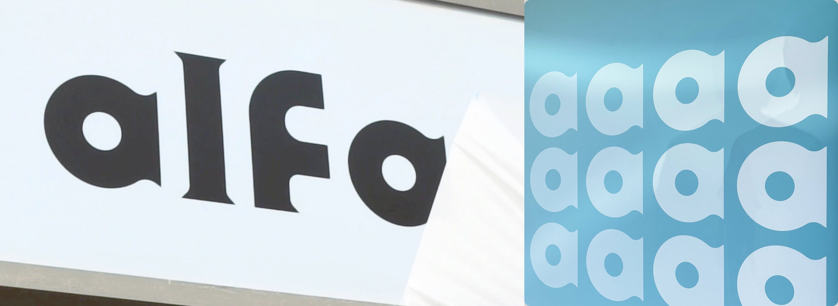
A promise in four letters.
a: always
l: live f: fresh &
a: authentic
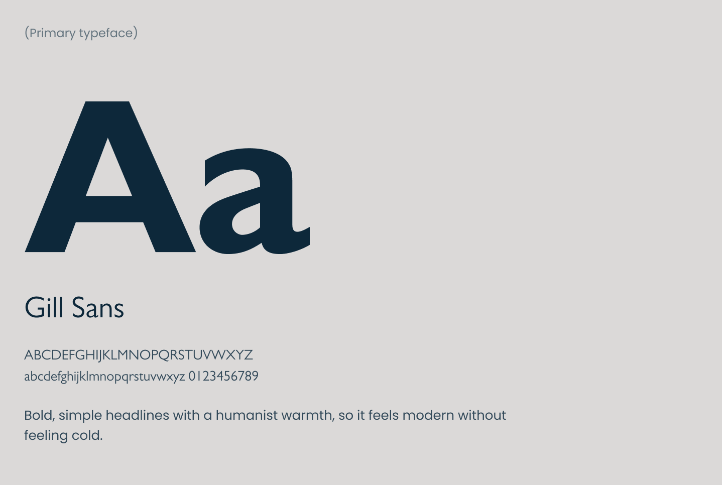
(Secondary typeface)
Aa
Barlow
ABCDEFGHIJKLMNOPQRSTUVWXYZ
abcdefghijklmnopqrstuvwxyz 0123456789
Clean, compact body copy and captions. The pairing keeps layouts uncluttered so the fruit and tea stay the hero.
Something brewing for every season
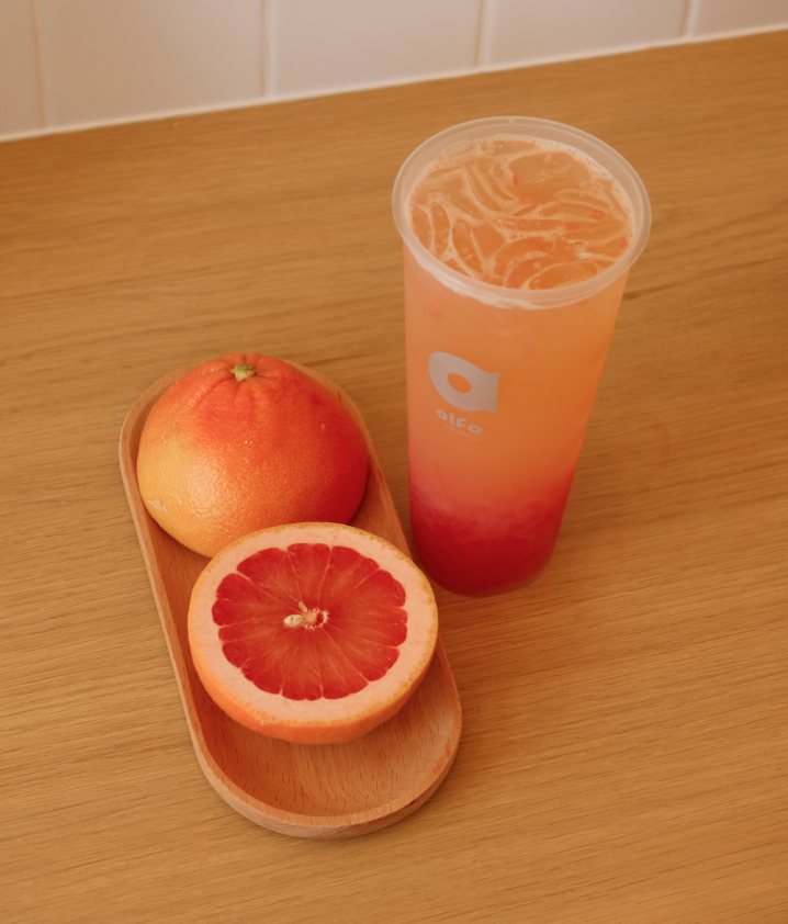
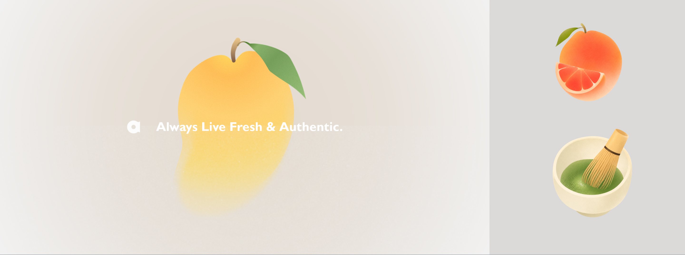
Social content follows the seasonal calendar: airy layouts, small type and the drink in the centre, with Reels of real ingredients up close. On delivery apps, the vivid fruit tones do the selling.
see their instagram +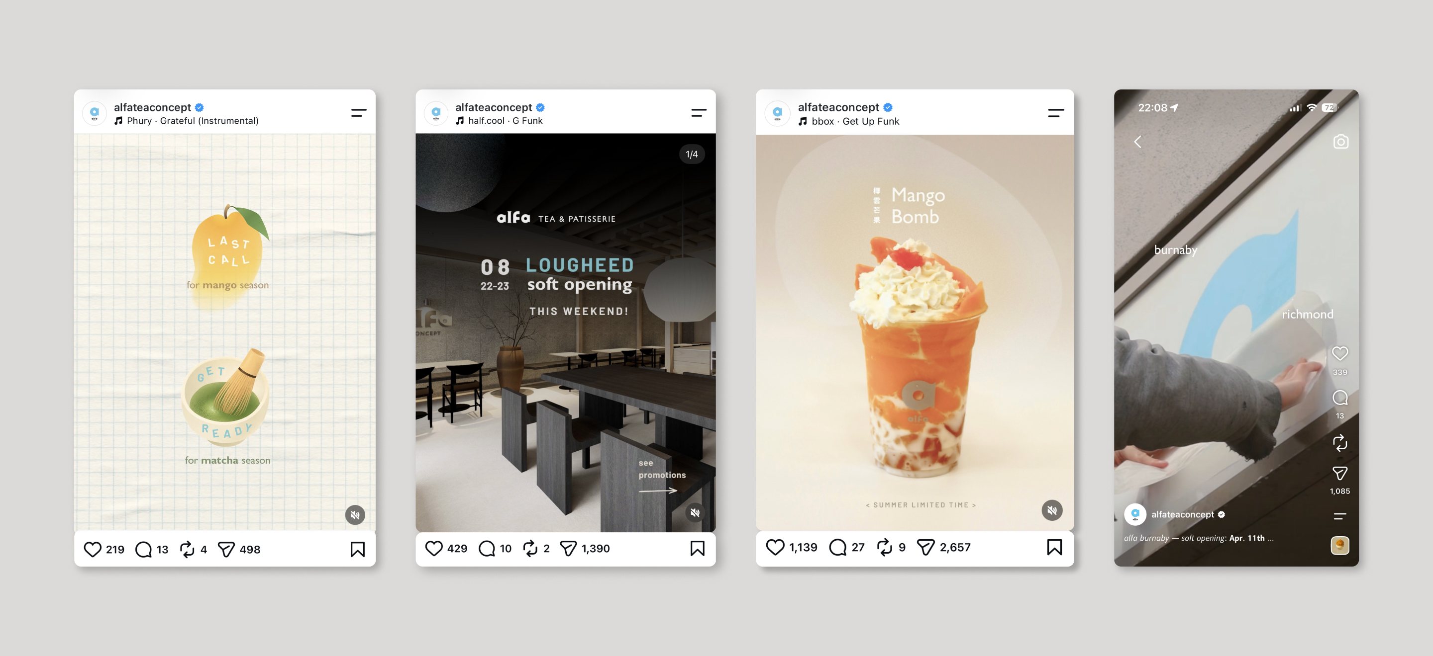
- 1.5M +Total views on social media
- 45K +Average views on reels
- 3,500 +Followers in the first month
- 20K +Total interactions on Instagram
- 7,500 +Content shares & sends
- 1hr +Waiting time during busy hours
supporting alfa’s continued
sustainment and growth
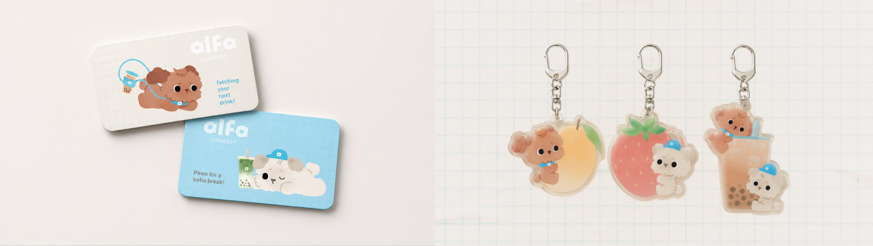
I continue to design seasonal campaigns and take the creative lead for marketing projects and creating merch such as keychains and giftcards; helping alfa stay true to their brand mission while expanding to more locations in metro Vancouver
- 11,000 +followers to date on instagram.
- 3 new storessuccessfully opened since the 1st flagship store.
Next Project.
chao shou wang →