(Client)
抄手王 Chao Shou Wang
(01)
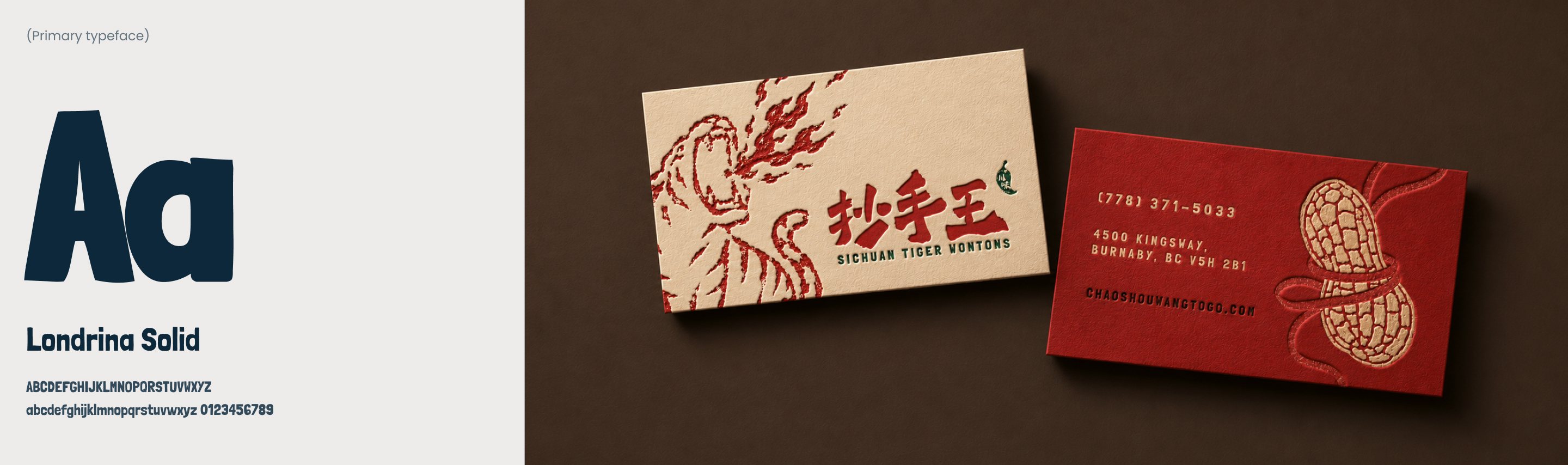
抄手王 (Chao Shou Wang) has been the king of wontons for fifteen years in Vancouver. It just never had any branded look to match their legacy.
Chao shou (抄手) is the Sichuanese term for wontons: thin-wrapped dumplings, typically filled with seasoned ground pork and ginger, that are boiled and served in broth or sauce.
(02)
The ask.
Refresh branding for a local legend, without polishing away its aged charm and cultural roots.
In Chinese food culture, the rougher the stall looks, the more people trust the food. The aim of this rebrand project is not to lean on a new polished look, but rather “rough on purpose”.
Bold
Hand-made
Honest
Legacy
Sichuan cuisine is known for their spiciness and strong flavours, like a kick to your palate.
From wontons to secret sauce, everything is hand-crafted, never premade or bought frozen.
More than a decade in business, never decreased portion size or overcharged.
Imitated by many but never replicated, the shop holds the crown of the best in the city.
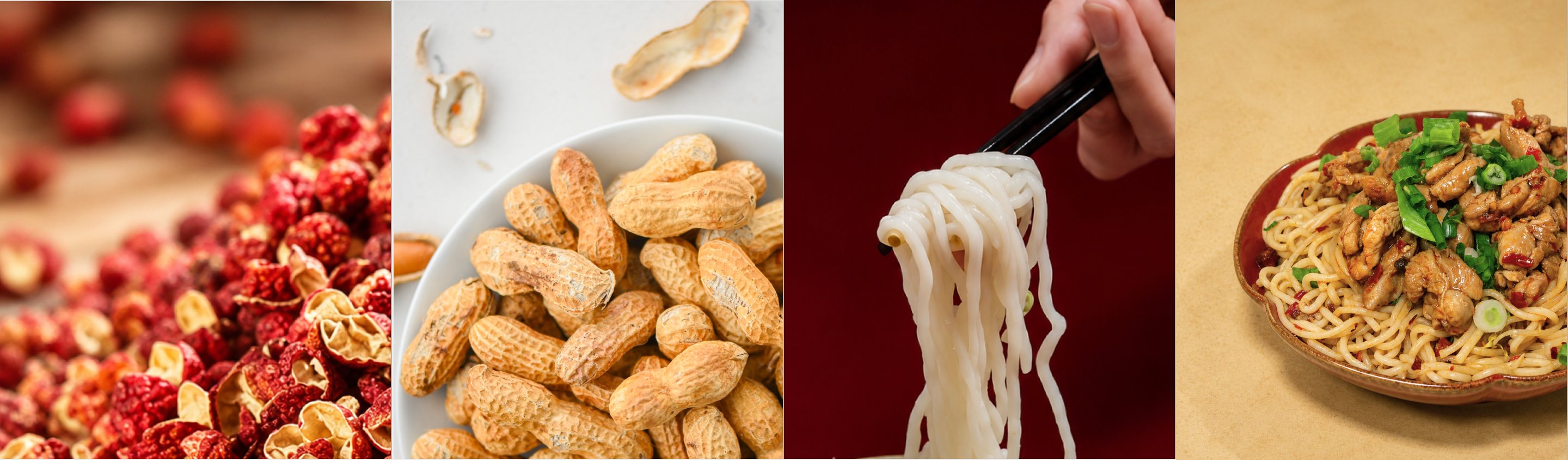
Huājiāo#A52127
Huāshēng#C98A47
Miàn#DCC893
Cōng#074C3C
The signature colour from its original logo: bold, warm and full of Sichuan energy.
An earthy accent for textured illustration and warm details.
A soft counterpoint echoing noodles, wonton skins, and other flour based ingredients.
Just like the leek on top of the dish, this color adds a finishing touch to make it “pop”.
Brown #3A110AGrey #7B7268Cream #E3DFD5
A name with tiger spirit.
In Chinese, “chao shou” means Sichuan chilli wonton, “wang” is king. Chao Shou Wang is a straight pinyin transliteration, which doesn’t carry the same weight of meaning.
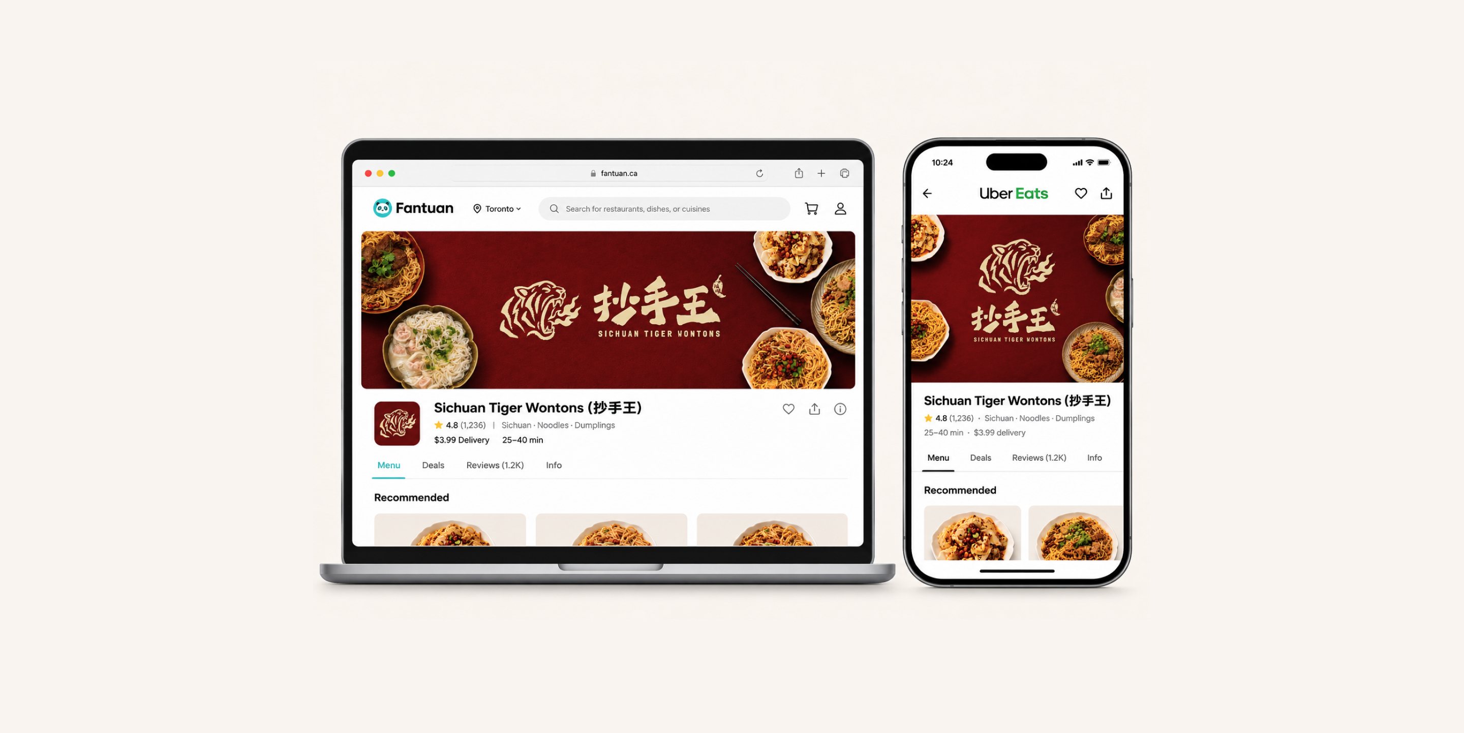
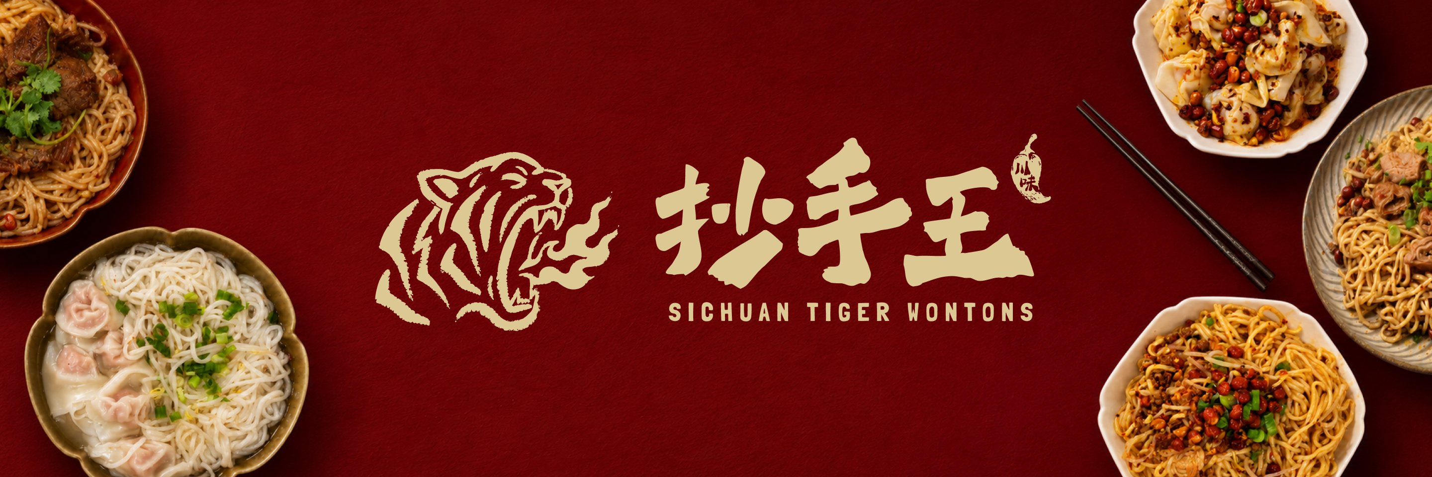
Tiger Wontons breaks out of the box. It alludes to the “king” with an animal motif; while making the dish memorable, easy to search for and recommend by word of mouth.

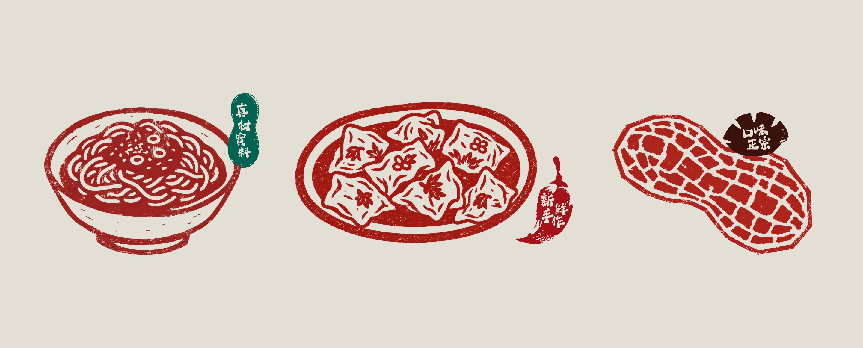
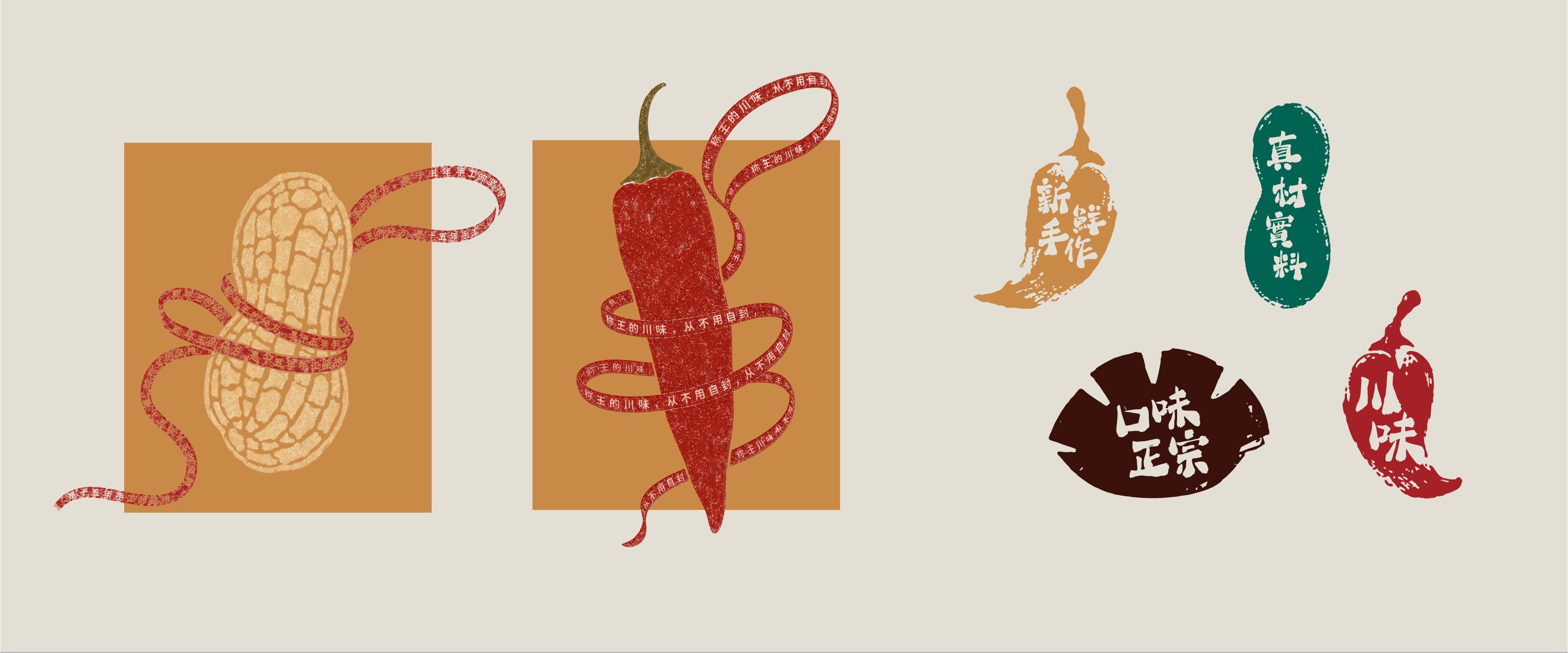
Crafted by hand, stamped with a seal.
The graphics push the art direction further with uneven ink, soft edges and a slightly different print each time, on purpose.
A stamp (印章) is a mark of authorship and approval in Chinese culture. To people who grew up with it, it feels like heritage. To someone discovering Sichuan food for the first time, it reads as artisanal and handmade.
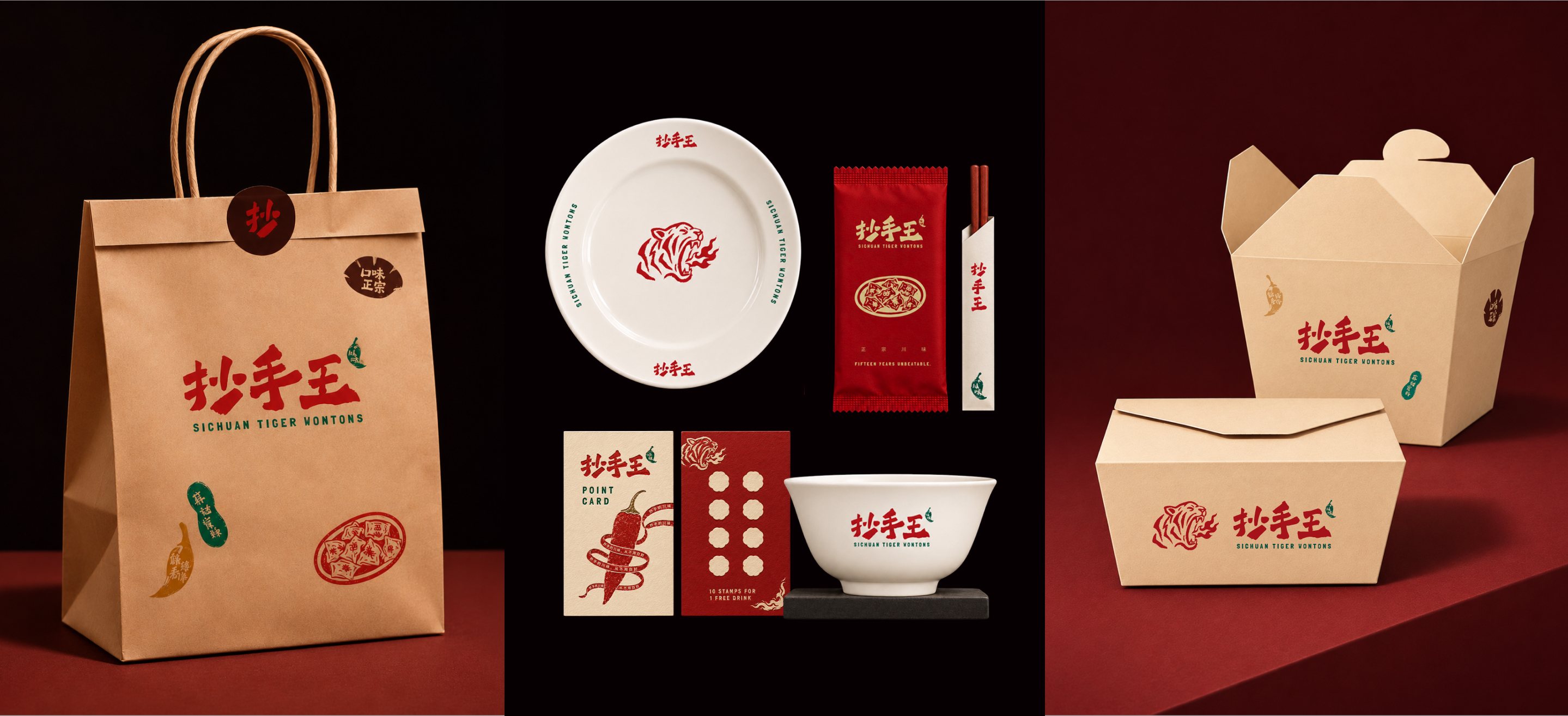
Bold taste speaks for itself.
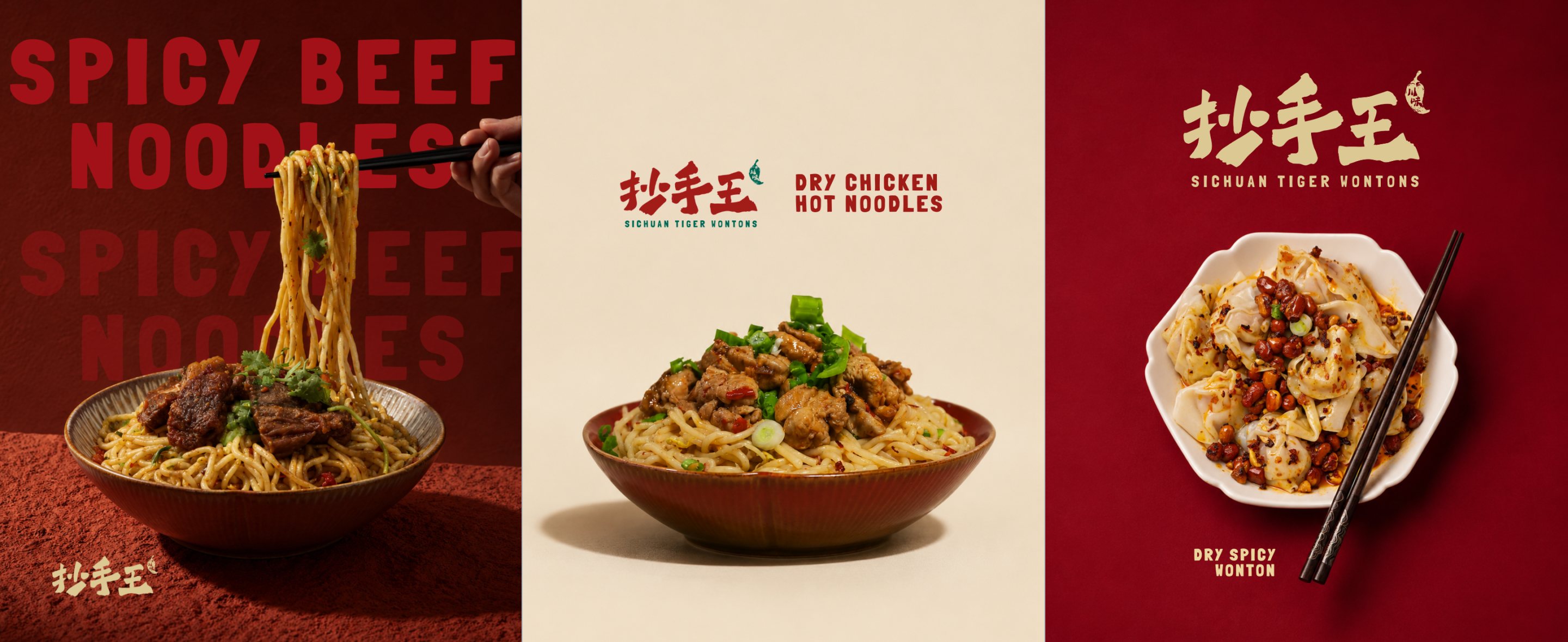
Each flyer puts a bold, plain name with one signature dish front and centre. No other decorations needed, the dish takes the main stage.
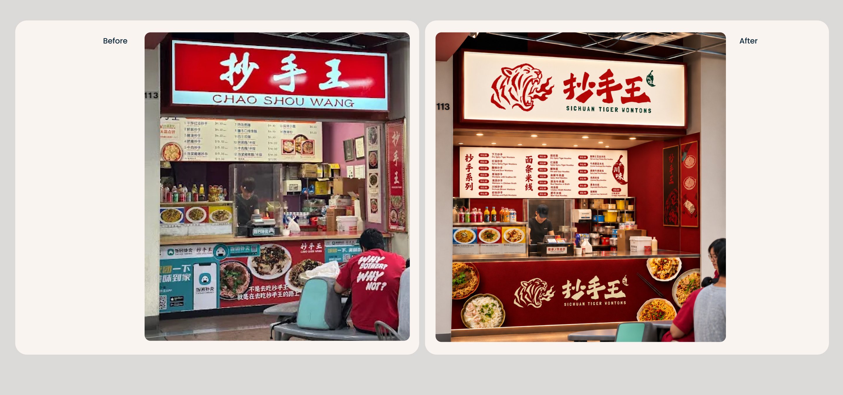
New look, same charm.
Lit from within, the red and cream sign stands out across a busy food court. The tiger and 抄手王 read from a distance, and a menu board with photos and clear dish names helps first-timers order with confidence.
Next Project.
meridian bridge →